飞机窗帘开关动画,HTML+CSS实现
兄弟们下午好,今天给大家分享个HTML练手小代码,飞机窗帘开关
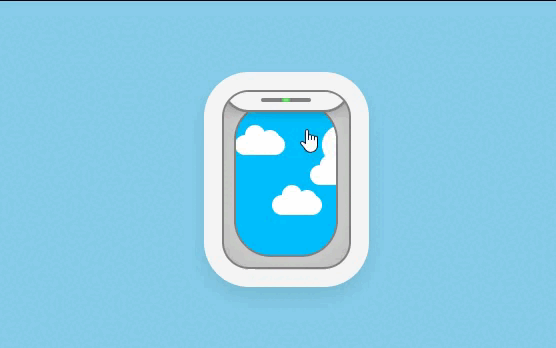
HTML代码
<!DOCTYPE html>
<html lang="en">
<head>
    <meta charset="UTF-8">
    <meta http-equiv="X-UA-Compatible" content="IE=edge">
    <meta name="viewport" content="width=device-width, initial-scale=1.0">
    <title>Document</title>
    <!--      引入css -->
    <link rel="stylesheet" href="./style.css">
</head>
<body>
    <!--在dom中增加表示云朵的.clouds元素.其中可以定义5个span子元素 分别代表1个云朵 -->
    <input type="checkbox" class="toggle">
    <figure class="window">
        <!-- 窗帘 -->
        <div class="curtain"></div>
        <div class="clouds">
            <span></span>
            <span></span>
            <span></span>
            <span></span>
            <span></span>
        </div>
    </figure>
</body>
</html>
CSS代码
/* 初始化 */
body{
    margin: 0px;
    height: 100vh;
    /* 弹性布局 */
    display: flex;
    /* 水平居中 */
    justify-content: center;
    /* 上下居中 */
    align-items: center;
    /* 定义背景颜色 */
    background-color: skyblue;
}

.window{
    /* 相对定位 */
    position: relative;
    /* 盒子模型 */
    box-sizing: border-box;
    /* 窗户视图宽是125px不包含外边有box-shadow 画的外边框 */
    width: 25em;
    /* 窗户视图高是125px */
    height: 35em;
    font-size: 5px;
    background-color: #d9d9d9;
    /* 边框变圆 */
    border-radius: 5em;
    box-shadow:
    /* 定义黑色边框 */
    inset 0 0 8em rgba(0, 0, 0, 0.2),
    /* 深灰色的边缘线 */
    0 0 0 0.4em #808080,
    0 0 0 4em whitesmoke,
    /* 深灰色的边缘线 */
    0 0 0 0.4em #808080,
    /* 给阴影加一个原始尺寸 这个尺寸是由第四个参数决定的 */
    0 2em 4em 4em rgba(0, 0, 0, 0.1);
    /* 这个地方加个hidden 未来使下面用到定位的时候,top:-5%的时候 可以将溢出的部分隐藏 */
    overflow: hidden;
}

/* curtain 是窗户的窗帘  和窗口尺寸一致 但不拉到底 */
.window .curtain{
    /* 绝对定位 */
    position: absolute;
    left: 0;
    /* 相对于窗帘的高度 计算向上移动一点 */
    top: -5%;
    /* 继承父标签的尺寸 */
    width: inherit;
    height: inherit;
    border-radius: 5em;
    background-color: whitesmoke;
    /* 给盖子加上边框 0.5em比上面的0,4em大一点能盖住之前的边框 */
    box-shadow: 0 0 0 0.5em #808080,
                0 0 3em rgba(0, 0, 0, 0.4);
                /* 给top元素加上过渡效果 */
    transition: top 0.5s ease-in-out;
    z-index: 2;
}

/* 当多选框被选中的时候, 窗帘网上飘走*/
.toggle:checked ~ .window .curtain{
    top: -90%;
}


/* 用伪类在窗帘上画出灰色长条 */
.window .curtain::before{
    content: '';
    position: absolute;
    width: 40%;
    height: 0.8em;
    background-color: #808080;
    left: 30%;
    bottom: 1.6em;
    border-radius: 0.4em;
}
/* 用伪类在窗帘上画出径向渐变的指示灯 */
.window .curtain::after{
    content: '';
    position: absolute;
    width: 1.6em;
    height: 0.8em;
    background-image: radial-gradient(orange,orangered);
    bottom: 1.6em;
    /* 100% 值得是窗户视图的唯一指示灯宽度,然后咱们可以将剩余的距离居中 */
    left: calc((100% - 1.6em)/2);
    border-radius: 0.4em;
}

/* 当窗帘被选中的时候,颜色变成绿色 */
.toggle:checked ~ .window .curtain::after{
    background-image: radial-gradient(lightgreen,limegreen);
}

/* 隐藏checkbox  */
.toggle{
    /* 绝对定位 */
    position: absolute;
    width: 25em;
    height: 35em;
    font-size: 5px;
    z-index: 3;
    /* 鼠标放上变小手 */
    cursor: pointer;
    filter: opacity(0%);
}

/* 用云朵容器画出窗外的蓝天 */
.window .clouds{
    position: relative;
    width: 20em;
    height: 30em;
    background-color: deepskyblue;
    left: calc((100% - 20em)/2);
    top: calc((100% - 30em)/2);
    border-radius: 7em;
    box-shadow: 0 0 0 0.4em #808080;
    overflow: hidden;
}

/* 云朵画出来 */
.clouds span{
    position: absolute;
    width: 10em;
    height: 4em;
    background-color: white;
    border-radius: 4em;
    top: 20%;
    animation: move 4s linear infinite;
}
/* 定义动画 */
@keyframes move{
    from{
        left: -150%;
    }
    to{
        left: 150%;
    }
}
/*   用伪元素 画 2个突起的圆弧 */
.clouds span::before,
.clouds span::after{
    content: "";
    position: absolute;
    width: 4em;
    height: 4em;
    background-color: white;
    border-radius: 50%;
}

.clouds span::before{
    top: -2em;
    left: 2em;
}
.clouds span::after{
    top: -1em;
    right: 1em;
}

.clouds span:nth-child(2){
    top: 40%;
    animation-delay: -1s;
}

.clouds span:nth-child(3){
    top: 60%;
    animation-delay: -0.5s;
}
.clouds span:nth-child(4){
    top: 20%;
    transform: scale(2);
    animation-delay: -1.5s;
}
.clouds span:nth-child(5){
    top: 70%;
    /* 变大1.5呗 */
    transform: scale(1.5);
    animation-delay: -3s;
}


作者:Yudada
标题:飞机窗帘开关动画,HTML+CSS实现
©文章版权不归作者所有。
@未经允许随便转载,记得艾特我。
📞部分内容综合整理自网络,如有侵权联系删除。
标题:飞机窗帘开关动画,HTML+CSS实现
©文章版权不归作者所有。
@未经允许随便转载,记得艾特我。
📞部分内容综合整理自网络,如有侵权联系删除。
THE END

